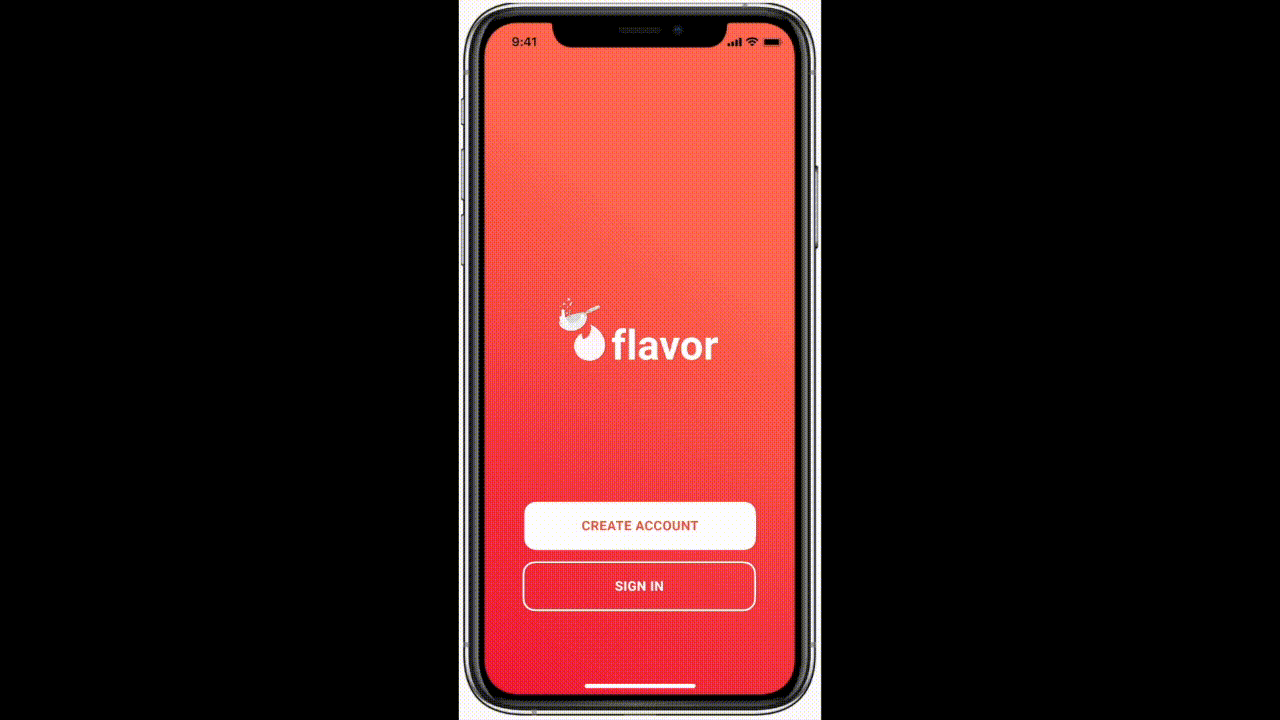
FLAVOR
Connecting people to authentic, locally-owned restaurants around the world in an effort to support and appreciate native cultures.
VIEW FINAL PROTOTYPE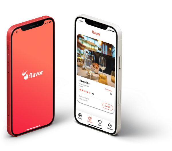
OVERVIEW
Travellers crave authentic food-related experiences where they can immerse themselves in the culture. It can get overwhelming having to search through various platforms and cross checking them with other references to make sure where you end up dining provides a geniune experience.
Flavor is an app concept designed to provide tourists with honest, reliable and relatable restaurant recommendations. It is a restaurant curation application that cuts down on the research process by connecting people with authentic dining expereince. Users can easily read reviews from restaurants they trust, chat with locals, and keep track of the places they want to eat at.
SCOPE
user research, user flow, sketching & wireframing, prototyping, user testing
DURATION
February - May 2021
TEAM
Zenas Lim, William Powers, Zeyu Chen, Yubin Heo
My team and I collaborated on this semester long project for our HCI Design course at Cornell University. We worked to understand and develop a solution to the question “How might computational technologies help tourists appreciate and explore different cultures through their food?”. All of us had the role of UX Designers and we worked along side each other through each step of the design process from research to prototyping and evaluation.
the challenge
Food, culture, and history are interconnected. While traveling, it can be difficult to find authentic local food, and even more challenging to appreciate the culture and history behind it. To identify and learn about local cuisine, travelers face language and culture barriers, inhibiting their ability to inquire with locals and determine the best places to visit. If a traveler does find a great restaurant, it is possible that unfamiliarity with the food could present issues or differences in etiquette could lead to misunderstandings. While exisiting similar platforms provide recommendations and reviews, they do not filter out the most authentic and seek to inform about the culture behind the meal. Additionally, referencing travel food blogs, vlogs, and paper guides can be unreliable as it is difficult for these platforms to keep up to date. Tourists travel with the goal of stepping out of their comfort zone, and what better way to do this than through learning to appreciate different cultures through their cuisine.
the solution
Flavor is designed to address these problems in a personal and efficient manner. We created an experience that allows the user to get a taste of what the restaurant has to offer as the application cuts down the research process and gives users a place to easily look through dining expereinces without the worry of if they are truly authentic. Users can easily keep track of the restaurants they like by saving them and creating collections. On the other hand, if the expereince is not what they’re looking for, users can simply dismiss the suggestion and a new option will pop up, allowing them to smoothly find a new “flavor of the week”. Overall, Flavor is a platform for travelers and residents a like to eat at restaurants and connect over local food. As a visitor, you get to immerse yourself in the culture and appreciate the traditions, expereince, and history, while getting to enjoy delicious food. At the same time, dining and conversing with locals can truly make an unfamiliar city feel like home, and eating great food is one of the most enjoyable experiences when traveling.
user research
We constructed a research plan to gain more insight into what the problems are when it comes to food recommendation apps when traveling. We focused on the following topics:
- Can you tell me a time when you last traveled and experienced authentic cultural food?
- Can you tell me more about how that made you feel?
- Why did you choose to go to that particular city/country?
- How did you find out about the different types of local food?
- Why did you choose that place to experience that cuisine?
- What issues exist with current food recommendation platforms?
- What do people feel is missing from these platforms?
- What do other platforms do that draws people to them?
Questions 1–4 have the purpose of getting us to understand the underlying thought process of what cusines, dishes, and locations stand out to a traveller. We wanted to know their motives for traveling to the location and by eliciting stories from past travel experiences, understand how food can influence their trips. Our goal is to be able to incorporate this thought process into the experience that we create.
Questions 5–8 are more targeted towards the current solutions. Here, we want to understand what problems exist in the current, more widely used platforms, and uncover the pros and cons of them to gauge where there is space in the industry to grow.
interviews
We conducted ten (10) interviews to get qualitative data.
Our participant criteria included:
- Ages 18+
- People who have traveled outside of their native country
- Individuals open to cultural food
The interview was broken down into three parts: introduction questions, experiential questions, and current solution questions. Our purpose was to address the above research questions and gain insight into how people currently go about finding restaurants in an unfamiliar location and what issues they run into.
affinity mapping
Affinity mapping was used to organise key information, phrases, quotes, and sentiments from the interviews and extract key themes between users. We broke down all of the interview responses and extracted user insights. Several different themes were discovered from grouping the post-its and iterating.

key findings
The affinity mapping revealed 9 overarching themes and numerous sub-themes. The themes show commonalities between users’ sentiments and capture the connections within data that will ultimately inform the creation of the key features.
The findings with the most opportunity are described below:
Research Overload: “I used a lot of different resources where many options overrated, views were skewed depending on population, and its hard to sort through and verify.”
Listening to Locals: “I relied on my host and people who knew what to order when it came to dining.”
Novel Experiences: “Since effort is made during traveling, I want to try unique stuff and indulge in the best of what that place and culture has to offer!"
Geospatial Matters: “I want to know where things are and if I can find places just by walking around. It really comes down to the location of a place and its convenience.”
Knowing the Crowd: “Sometimes its not easy to tell whether an establishment is authentic or not without actually going to the restaurant and seeing the patrons and surroundings.”
market research
We looked into existing solutions to learn more about their strengths, weaknesses, and features to better understand what is already available to the users.

user personas and journeys
The accumulation of the user research and key findings led to the creation of 2 user personas and their respective journey maps. The personas are a direct reflection of the collected data and showcase different types of users and their goals, frustrations, motivations, behaviours, and personality.
The journey maps follow each persona’s unique journey of searching for a restaurant and maps their actions, emotions, behaviours, and feelings during this process.


storyboard
A user scenario that could be applied for both types of users was created. This scenario reflect one way they could use Flavor based on their needs.

Jack has arrived in Spain and is loocking for a quality, local restarant. He does a search and is immediately overwhelmed with the number of results!

He looks through the results for a bit but can’t keep track of all the recommendations. Fourtunately, Jack remembers he downloaded an app that will give him local food options and allow him to support small businesses in the area!

He easily goes through the app and swipes through the options. He has the peace of mind that he can save these restaurants without having to do additional research and worry if they are truly authentic.

Eventually, Jack stubles upon a place that looks very promising and anxiously awaits for the detaiils.

He reads the information about the restaurant, what the patrons have to say about the place, and even gets a food suggestion from a local. He is relived and excited that the search is over and he can enjoy an amazing meal!
initial designs
After understanding our users, their goals, and their journeys, we were ready to start designing the first prototypes. We started with sketches and user flows before generating a set of initial wireframes.

With these initial sketches, we brainstormed a flowchart to help us gauge which screens we would need to create for the prototype.

The sketches were translated digitally in Figma to create a low-fidelity interactive prototype. We explored the layout of restaurant profile, restaurant information, favorites page, and message functionalities on the app. We kept this iteration less detailed to minimise investing time into a design before getting users’ input.

mid-fidelity prototype
In this iteration, we explored colors, typography, and interactions for the main screens in the flow, incorporating the previous wireframes and the style tile together to bring the Flavor brand to life. This includes swiping through restaurants, reading the information, checking out the reviews, adding the restaurant to your favorites, messaging a local for recommendations, and the account settings if the user needs to adjust or add information such as dietary restrictions or location.


Finally, using the mid-fi frames, we finished building out the rest of the crucial screens of the app, refined components and visual styles, restructured content, and refined key processes. We focused on the interactions and processes the users would face as they go through the app for the first time.
VIEW PROTOTYPEusability testing
After we finished our prototype, we tested the model with potential users. We came up with a few tasks that covered the main functionalities of the app. We asked three (3) people who fit in one of the target audiences to complete the following tasks to the best of their ability. The tasks were related to each primary function of the app, including: finding a particular restaurant, finding general information about the restaurant, adjusting the setting to abide by their preferences, asking a local for help, and adding a restaurant to their favorites.
Number of participants: 3
All Remote
Ages 19-23
Summary
- Easy and fun to swipe through restaurants
- Users found it to be a stress-free experience
- A lot of information to scroll through
- 1 out of 3 users did not understand the purpose of the “chat with a local” button
- Adding restaurants to favorites and creating collection was easy
- Wording and labeling was confusing
- All testers did not know where to edit info or access the settings
- Users unsure of cultural significance of restaurant
iterating
Taking into consideration the feedback from usability testing, we iterated on our mid-fidelity prototype. We also updated the user flow to better represent these changes.


Preferences and accessibility
From testing, no clear way to add preferences.
- Select dietary preferences once creating account in order to generate personalised content and recommendations within the app
- Not every user speaks and/or understands English --> add your languages in order to clarify to other what languages you understand. Allows the community to chat easily with one another and have a more accessible expereince while intereacting with the application.

Organizing information
From testing, users did not notice the previous entry points when they were located in the top right corner.
- Icons were not clear and were not labeled clearly --> decided to remove the corner icons and add a navagation bar that clearly states what page is what.
- When scrolling through the restaurant information, there was just too much to read.
- Broke the information up into categories to makeinformation more digestable.
Restaurant transparency
From testing, users were unsure of what made the restaurant culturally significant and authentic.
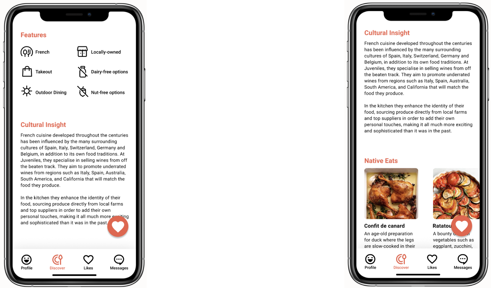
- Added information about the cultural impact of the restaurant and noteworthy dishes that locals tend to eat to showcase the significance of the restaurant and inform the visitors about its history and culinary traditions.
- Additionally, added a features section to reflect important aspacts of the restaurant and to highlight the dietary preferences that were selected by user
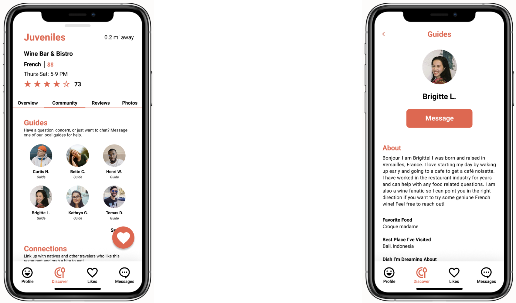
Locals & Connection
From testing, users were unsure of what the “chat with a local” button was for.
- To offer more clarity, a section was created where local guides and users can come together and offer support and help.
- Users can select a guide, read more about them, and ultimately message them with whatever questions or concerns they may have.
- Additionally, users can message others who have liked the restaurant and form connections.
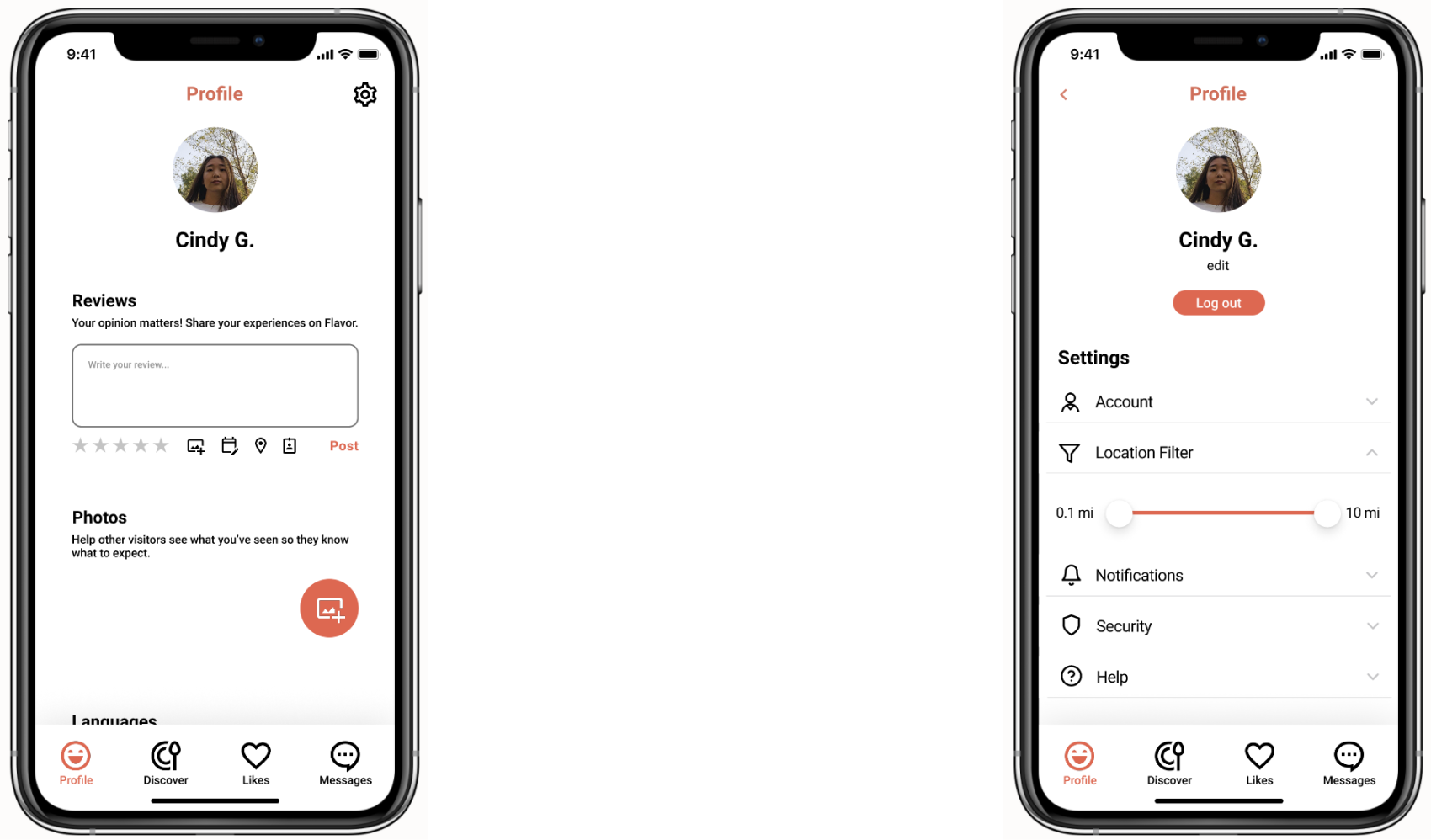
Profile page
From testing, users were unsure of how to access the settings and edit their information.
- Profile page was built out to include a section to add reviews and phots and edit your langages and dietary preferences.
- Settings icon was added to the main profile page and from there users can adjust additional filters and information.
final design
reflection
REAL-WORLD APPLICATION
How would verifiying restaurants and locals work in real life? In an ideal scenario, I’d have access to a team of researchers who would scour the many different resources out there and enlist different restaurants that are deemed authentic and local. The other issue is finding locals, especially in areas that are not as populated or well known, to act as a sort of consultant.
TEST, TEST, TEST!
Conducting andevaluating interviews & usability tests yields is a highly valuable experience. Engaging with users allowed me to empathize with them better and realize the importance of a user-centred approach to design. While more testing is always beneficial, the qualitative data I did receive revealed deeper and more accurate findings for a stronger end product.
STAYING ON TARGET
It can be difficult to remember the overall purpose of the application one is designing since there are so many things to consider and keep track of. Throughout this project, my team definately temporarily lost sight of what our focus was as seen when we forgot to include information about the cultural significance of the restaurants. However, through feedback and testing we were able to re-center ourselves and create an end product that we felt succeeded in connecting users to local dining expereinces.
conclusion
Overall, this was a great exercise in restraint. It took a lot of patience, focus, and openness to both good and bad ideas in order to whittle away every unnecessary step. In particular, I learned a lot by working with a group and being able to listen to different perspectives and bounce ideas off each other. Ultimately, thanks to a determination to stay on task and ability to effectively collaborate together, the end result is a product that effortlessly showcases distinctive, authentic dining options and acknowledges local cultures.