OVERVIEW
As a project to introduce a new feature to an existing app, I created a way to discover content within VSCO that allows the users to connect with individuals who have similar interests.
THE PROMPT
Digital product design students will ideate on problem areas of existing applications and execute thoughtful solutions.
SCOPE
user research, user flow, sketching & wire framing, prototyping, user testing
DURATION
March – May 2021
background
VSCO is a photo-sharing and editing app that takes a twist on the classic social media experience. The platform is devoid of likes, comments, and follower counts which allows the user to focus on the photo-sharing experience instead of worrying about media engagement. VSCO encourages its users to express themselves and find the content that speaks to them.
On the discover page, there are photo challenges, editorials, and broad categories that are supposed to attract the interest of the user and assist them in finding new content. However, many users find that the discover page is confusing and severely lacking in content that is compelling to them, and thus, they do not interact with it.
VSCO’s discover page is hard to navigate and lacks content that is compelling to users which, in turn, deters them from interacting with the page. But people wish to find more photos and videos that align with their interests instead of relying on arbitrary topics that mean nothing to them. How might VSCO allow for a deeper sense of community while enabling users to find content that speaks to them?
user research
The first step was understanding who the users were and their pain points.
The research goals were to:
- Understand if the users browse through the suggested trends and look through the discover page.
- Discover how people find content and what gets their attention.
- Learn what makes someone follows a new account/what people look for when deciding to follow a person.
I found 4 participants to interview who generously volunteered their time to share some pain points and experiences.
Ages 18-24
3 were active users, 1 was an outlier who had never used the application.
Behavioral and attitudinal questions were asked during user interviews, such as:
Can you walk me through what you do when you first open the app?
What is your (first) impression of the discover page, feed, profile, etc.?
What is your process when looking at your feed?
What type of accounts do you follow? What photos do you like to see? Why?
What is the most frustrating part about using the app?
Here’s what I learned
1. The discover page is underutilized because the categories are uninspiring and the search feature is not very accessible.
I don’t usually check the discover page since it’s not for me. It’s too generalized and not catered to what I like. Also, I’ve never really payed attention the search function much less used it.
2. Users look for posts they have a connection with.
I notice new content through the reposts of the accounts I follow and through people’s personal collections.
3. It’s hard to find accounts and even friends to follow from only using VSCO.
My friends will tell me to follow them or I find people’s VSCO accounts through their Instagram biography. Otherwise, I do not know how to find accounts that interest me.
4. Users want to find more content that speaks to them.
I would like to use VSCO more, however, since I can’t find people to follow, my feed remains unchanged and I don’t feel incentivized to check regularly.
people problem
VSCO users want to find material that speaks to them, but they can’t do that well because:
- They don’t want to look through content they don’t have a connection with.
- They cannot find users they relate to.
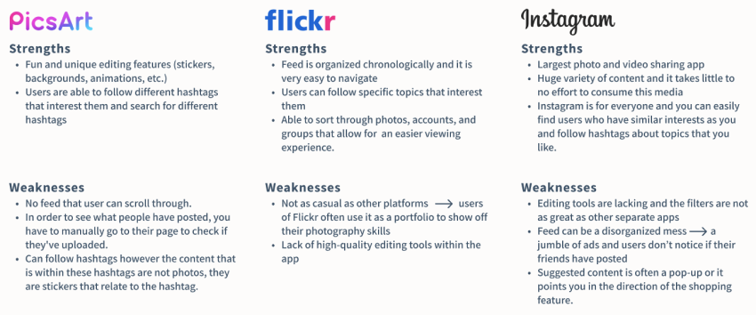
competitive analysis
I looked into competitors to learn more about their strengths, weaknesses, and features to better understand what is already available to the users.
approaching a final design
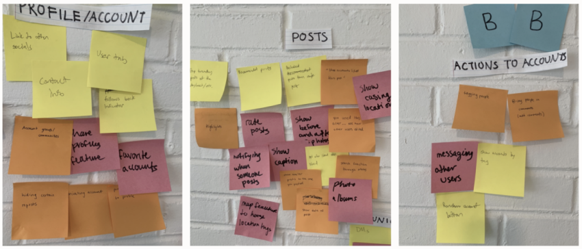
After going through several packs of sticky notes, three key opportunity areas were identified: Profile, Posts, and Actions to Accounts. From these spaces, I decided to look into three possible solutions that would tackle the People Problem.
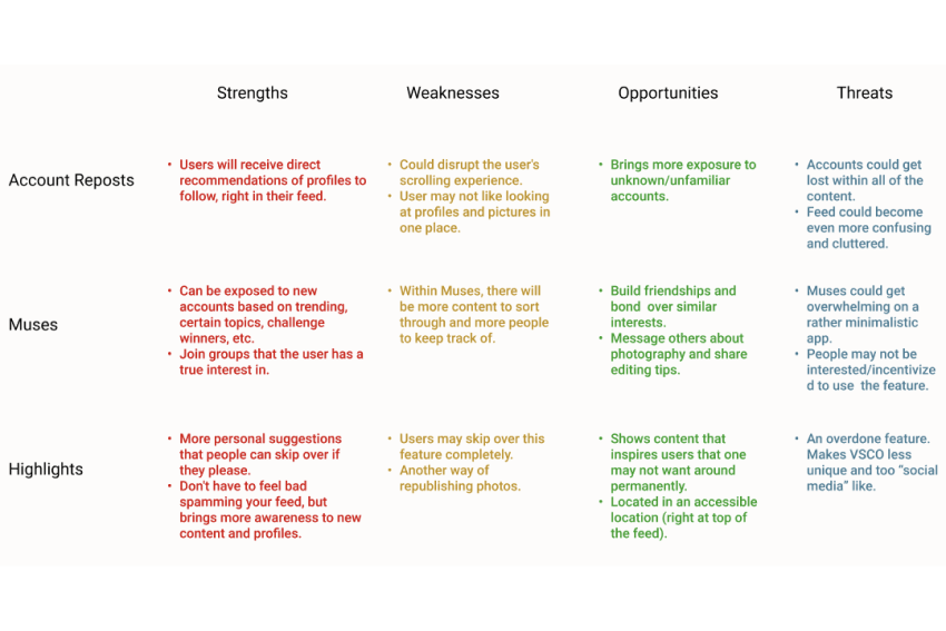
Account Reposts: Similar to reposting photos, users can repost their favorite accounts. This allows other individuals to easily discover new profiles that inspire them right within their feed; instead of having to dig through search results.
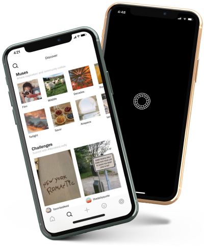
Muses: Users can come together and connect with other people with similar interests. These communities, or “Muses”, promote the discovery of other creatives and imaginative content.

Highlights: Users can add content to their highlights that will appear to their followers at the top of the feed page. This allows the users to see exciting content of other unfamiliar accounts.
To compare each feature, I used a SWOT diagram and constructed a feasibility matrix:
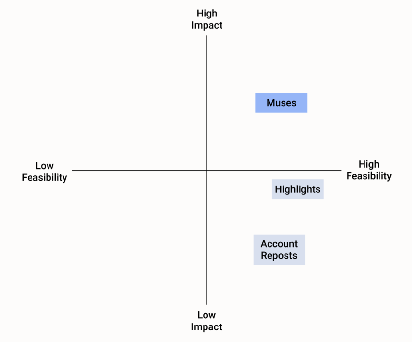
After looking over the results, I decided to move forward with Muses because of its high feasibility/impact and its ability to foster a sense of community between creators who wish to explore their inspirations.
materializing the muses
I created the preliminary information architecture of VSCO to visualize which screens were necessary and how they connected to others within a hierarchy.
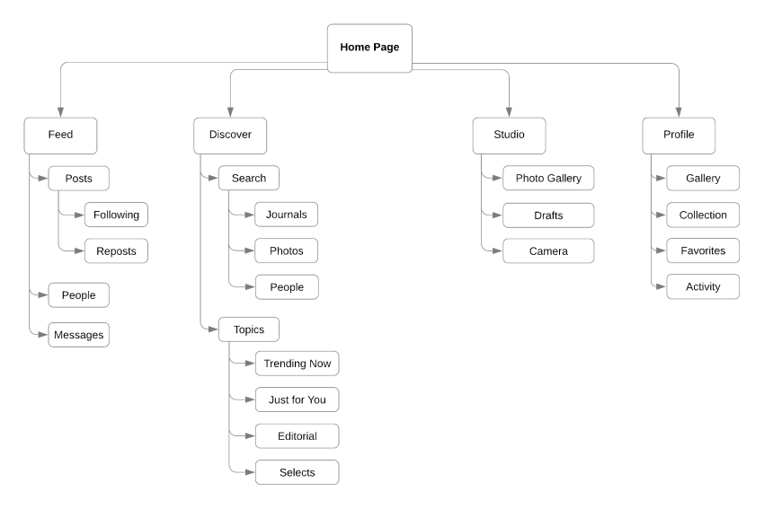
As I reflected on VSCO’s existing information hierarchy, I was still unsure as to where the entry point would be. Muses should be seamlessly integrated and the feature should be noticeable to the users but also situated in a way that does not take away from the app’s principal functions. To get a better understanding of the possible places the Muses could fit and where the users may try to access them, I created medium fidelity screens to explore the possible entry points.
medium-fidelity exploration
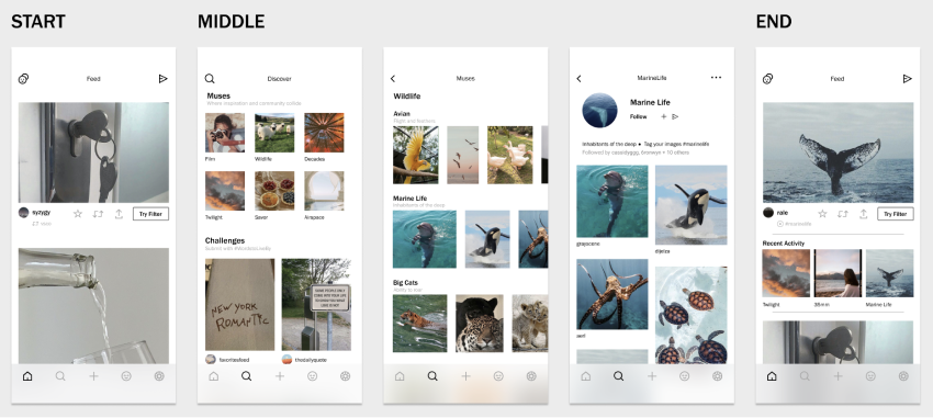
I began by defining my start, end, and middle points, to explore different modes of interactions:
1. Start- navigate to Muses
2. Select a Muse that interests you
3. Browse through Muse content
4. Follow Muse
5. End- return to feed and refresh to see new posts
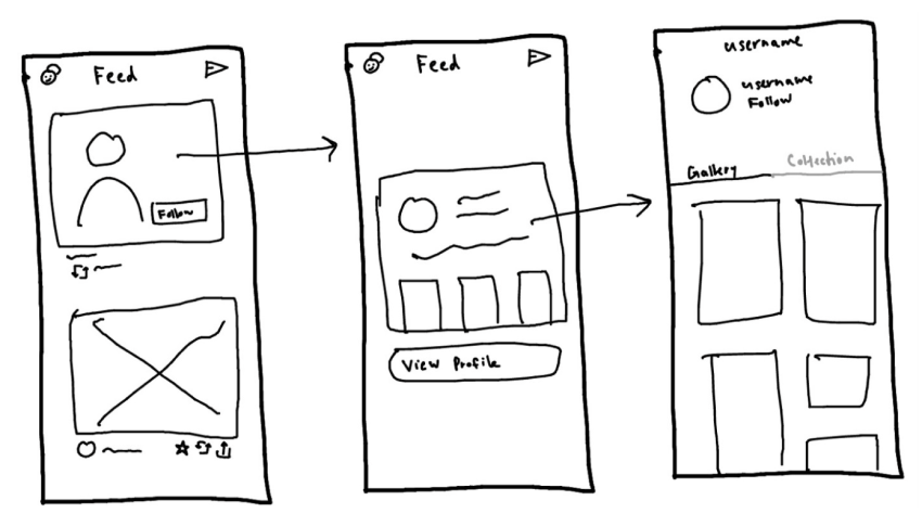
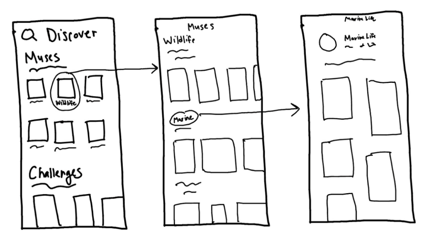
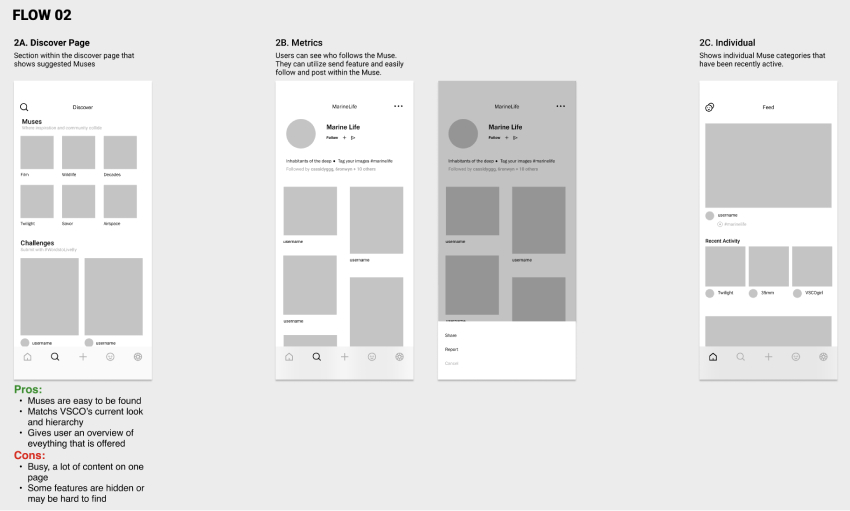
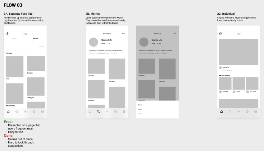
The images below show three flows. The challenge of each flow was deciding the entry point: while I felt the feature would be central to interactions, I didn’t know whether or not it fit within the feed, but having a separate tab in the search function was too hidden and could be confusing.
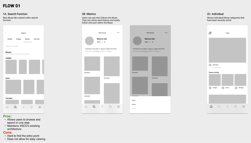
In flow 1, having the entry point be through the search function is unintuitive and unappealing. From my initial interviews, many users do not use the search function and do not think to check there when they open the app.
In flow 2, Muses are presented on a page that the users frequent most. However, placing this feature with in the feed and breaking it up into separate components interrupts the browsing experience. The feature feels out of place and this entry point may confuse users about the functionality of Muses.
In flow 3, Muses are noticeable since they are at the top of the page and the placement fits in with VSCO’s current hierarchy as this is where all of the other suggested content is housed (i.e., Trending, Editorials, Selects, etc.). However, similarly to flow 1, some users may have a hard time with this entry point as they do not frequent the discover page.
Ultimately, after weighing the pros and cons, I decided to move forward with entry point flow 3.
high fidelity designing and prototyping
My final high-fidelity design built on my user interviews, analysis, and insights from my earlier explorations lead me to create the working prototype. The prototype was used to test the content discovery process and to unearth usability concerns.
Hi-Fi Flow
 VIEW PROTOTYPE
user testing
I conducted user testing to assess how easy it is to find the Muses within the VSCO app. I also wanted to understand what information do users want to know when previewing the feature and observe how the users go through the discovery process to find any hang ups or confusions with the design. Testing allowed for a more collaborative approach by bringing users into design decisions and incorporating their raw feedback.
Number of participants: 4
In person using the Figma Mirror app
Ages 20-25
Summary:
- Positive feedback in regards to incorporating feature into existing architecture and overall concept
- Testers were able to find quickly find Muses and look through posts
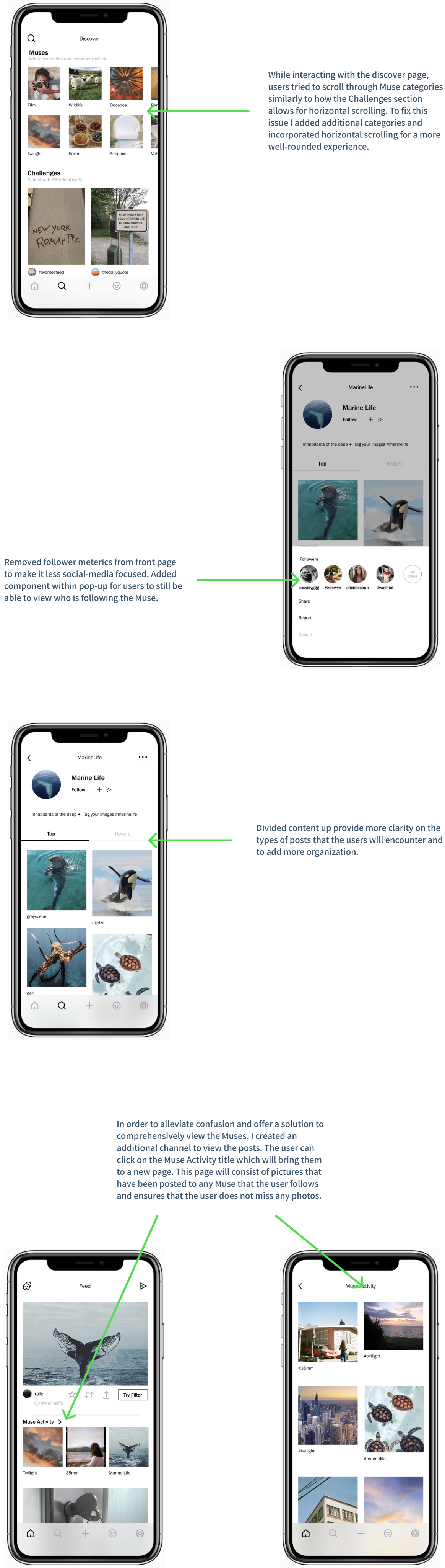
- Appreciated that they could see who followed the Muse but didn’t like how the followers were emphasized on front page
- Confused about how the posts are organized
- Besides viewing the specific Muse posts in the feed and their respective pages, users wondered if there was a way to comprehensively see the posts
- Feed can be overwhelming at times as it's hard to keep track of what picture is what-- adding another type of post incorporates more clutter to the mix
iteration
Taking into consideration the feedback from usability testing, I iterated on the prototype and updated the designs.
ui kit
Applying the visual styles that VSCO currently uses to Muses.
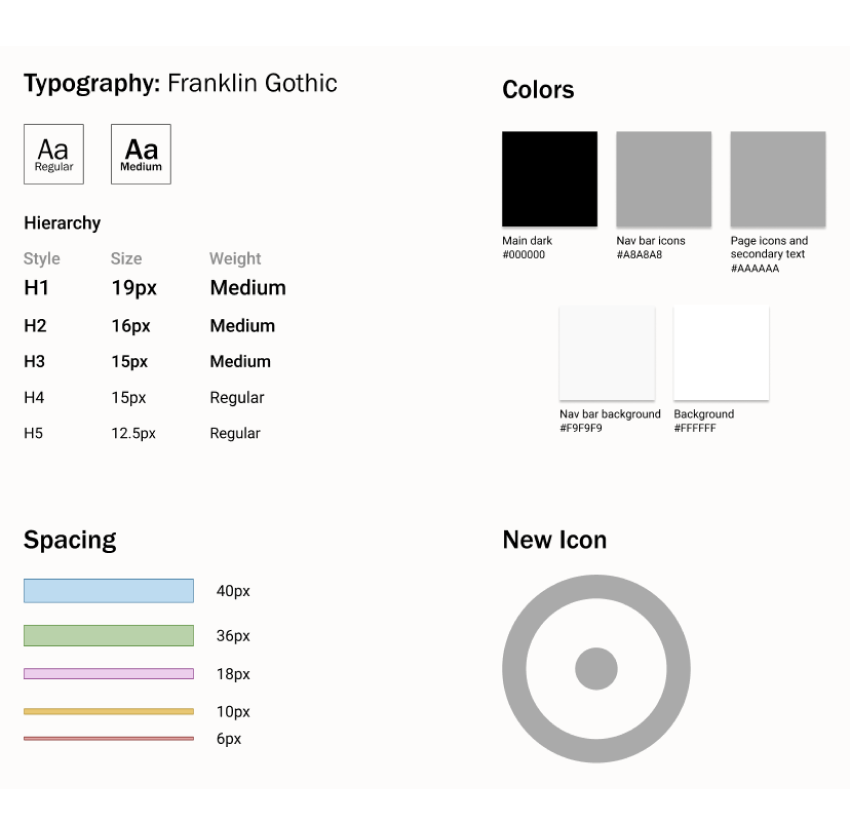
While establishing the visual design elements, I also designed an icon for the Muses. Since the photos will show up in the feed, an icon is needed to differentiate Muse posts from regular posts and republished posts. This design, which draws inspiration from Relationship Circle diagrams, depicts individuality while being a part of a larger circle. This icon matches the minimalistic and sleek design that VSCO embodies and represents what it is like to be a part of a Muse.
final design
concluding thoughts
VSCO emphasizes the fact that it is a place where individuals can come to find inspiration and explore new ways to create. However, the discover page, where users are supposed to find new content and accounts, is lackluster as it only suggests broad, extraneous topics that do not appeal to the large variety of users on the app. VSCO is missing a way to explore and connect with content that the USER enjoys. With Muses, the user is at the forefront as they are in control of choosing what topics to follow and what topics to interact with. Within the Muses is a community of individuals who can come together and bond over a shared interest. This feature adds a new element that enhances the fact that VSCO is a platform for creatives who are free to express their true selves and connect with other storytellers.
This was my first time doing a case study on an already exisiting application, and my first time working on a project by myself. Adding features to existing designs presents a challenge distinctly different than creating completely new concepts as designers not only need to create the feature itself but also need to consider where the feature fits in the product’s hierarchy. I struggled with determining the where the best entry point would be because it was hard to understand the importance of each facet, and how much impact my feature would have.
next steps
Over the course of the 10-weeks, I wish I had more time to asses and adjust my design with a larger group of participants. I value the feedback I received, but I would have liked to hear opinions from a more diverse population of my target audience.
If I had more time I would have also liked to focus on how the user would be able to create their own Muse groups as opposed to being dependent on the selection provided by the application.